The dial is where the story begins for almost every watch. It’s where our eyes first wander, drawing us in and setting the tone for the entire piece. At Emerton Scott, we believe a great dial should do more than just tell the time. It should carry meaning, tell a story, and reveal details that keep you discovering more the longer you wear it. For the Evermont, that philosophy shaped every choice we made.
Inspired by Korean film and its use of subtle symbolism, we wanted the Evermont dial to carry hidden meaning and details that feel personal to each wearer. For me, as a husband and new father, the Evermont represents the journey of becoming the best version of myself for my family — and the pressure that comes with that responsibility.
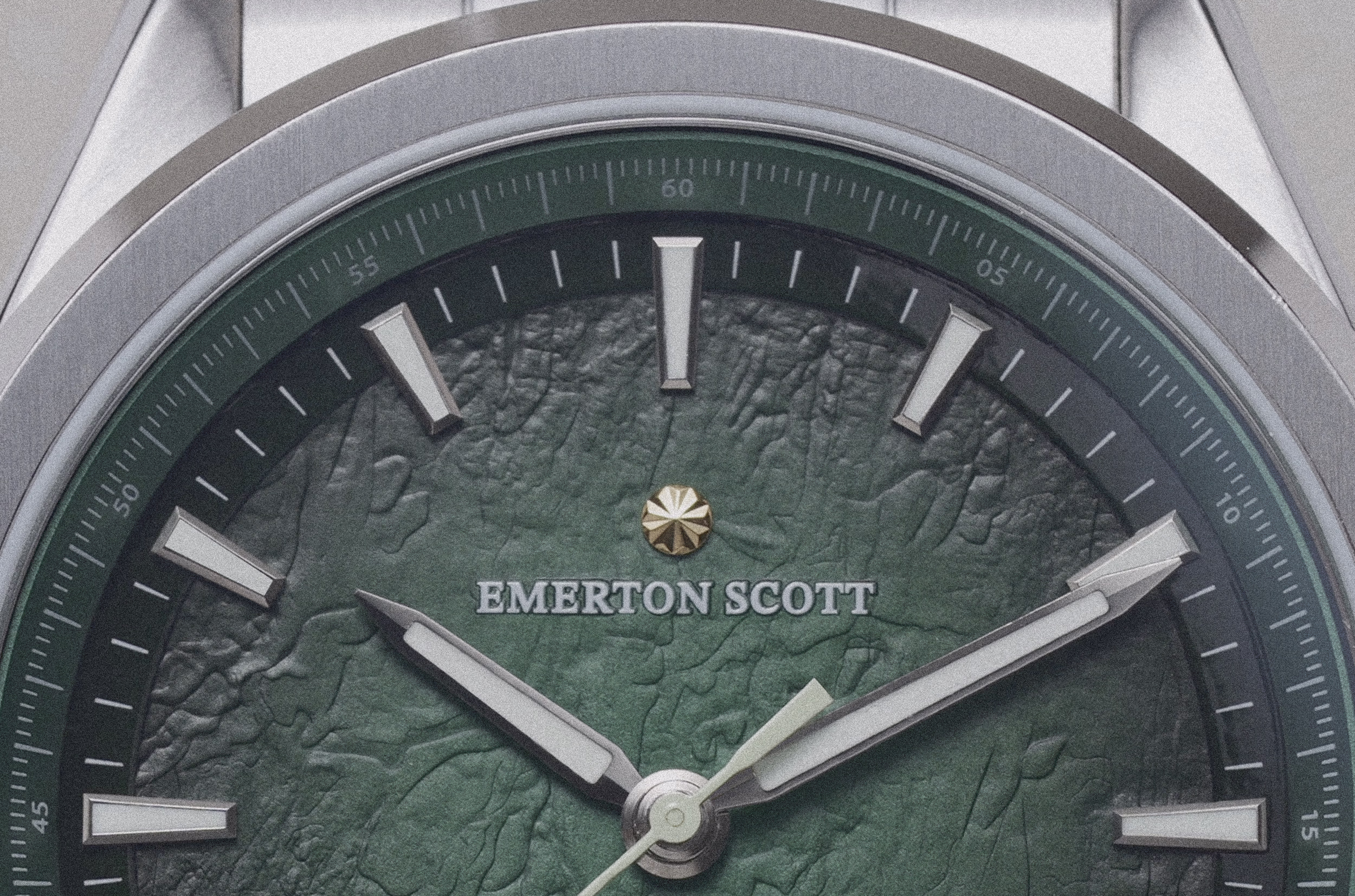
Pressure is part of any meaningful journey, no matter who you are or what you are trying to achieve. That theme became the heart of the design, leading us to use high-pressure stamping to craft the center of the dial. This method brings the surface alive, allowing light to dance across subtle textures, creating highlights and shadows that shift throughout the day.
To give the dial more presence, we layered in additional details. A fumé effect creates a smooth transition from light to dark at the edges, adding richness and tying back to the story of resilience under pressure.
Two chapter rings further enhance the structure, framing the inner dial to create form and organization: one on the outer edge for precision, and an inner ring with a sunburst effect that adds depth and visual interest.
A well-balanced dial feels effortless, but it rarely happens by accident. Initially, the date window was positioned at 3 o’clock, like most brands using the reliable Miyota 9019 movement as a base. But we felt it disrupted the symmetry.
Repositioning it to 6 o’clock created perfect balance. Though it required developing a custom date wheel — significantly increasing production cost — it was a decision we felt essential to make the Evermont truly complete.
To take it further, we designed a dedicated typeface for the Evermont’s date wheel, refined to ensure the watch feels at home in both casual and formal settings.
Every element was created with intention. The Emerton Scott rosette logo — our symbol of relentless pursuit of mastery — sits proudly at the top of every Evermont dial. The hands and indices share clean lines and a classic nature, reinforcing a sense of cohesion and deliberate design.
When it came to color, we wanted something timeless yet full of personality. We wanted to design a small selection of dial colour ways that could match and harmonise with any mans outfit, but also stand out while staying versatile.
The Evermont dial is offered in two timeless finishes: Celestial Blue, symbolising endless possibility and quiet ambition, and Imperial Green, representing legacy — what you build and who you build it for.
Both shades are classic yet unique, designed to feel elegant at any occasion.